Reusable Dialog Component with Tailwind CSS and React JS
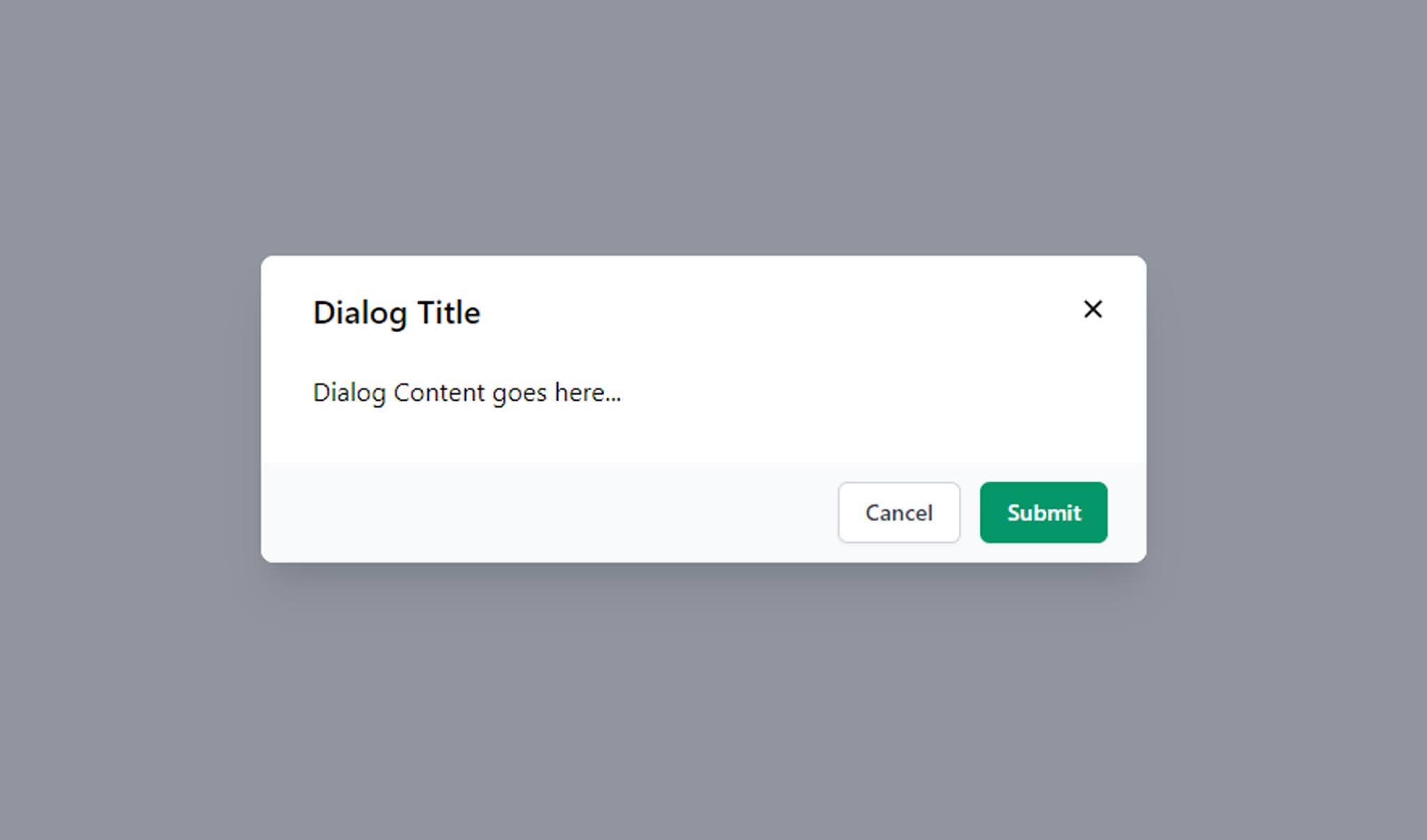
Create a basic layout for Dialog component in src/components/Dialog.jsx as shown below.
// src/components/Dialog.jsx
import React from "react";
function Dialog(props) {
return (
<div className="fixed inset-0 z-50 overflow-auto bg-smoke-light flex
transition ease-in-out duration-700">
<div className="fixed z-10 inset-0 overflow-y-auto">
<div className="flex items-end justify-center min-h-screen pt-4
px-4 pb-20 text-center sm:block sm:p-0">
<div className="fixed inset-0 transition-opacity" aria-hidden="true">
<div className="absolute inset-0 bg-gray-500 opacity-75"></div>
</div>
<span
className="hidden sm:inline-block sm:align-middle sm:h-screen"
aria-hidden="true"
>
​
</span>
<div
className={`inline-block align-bottom bg-white rounded-lg text-left
overflow-hidden shadow-xl transform transition-all sm:my-8
sm:align-middle ${size}`}
role="dialog"
>
</div>
</div>
</div>
</div>
);
}
export default Dialog;Now add the Dialog Close Icon funtion.
// Dialog CloseIcon
const CloseIcon = () => {
    return (
      <span className="absolute top-0 right-0 p-4">
        <button
          onClick={handleCloseDialog}
          className={`focus:outline-none focus:border-none
          hover:${color}-700 p-2
          rounded-full inline-flex items-center`}
        >
          <svg
            class="fill-current text-black hover:text-white"
            xmlns="http://www.w3.org/2000/svg"
            width="18"
            height="18"
            viewBox="0 0 18 18"
          >
            <path d="M14.53 4.53l-1.06-1.06L9 7.94 4.53 3.47 3.47 4.53 7.94
            9l-4.47 4.47 1.06 1.06L9 10.06l4.47 4.47 1.06-1.06L10.06 9z"></path>
          </svg>
        </button>
      </span>
    );
  };
Now add Dialog Header, Body and Footer
// Dialog Header part
<div className="relative px-8 pt-5 bg-white w-full flex-col flex rounded-lg">
  <div className="text-xl font-semibold">{title}</div>
  {CloseIcon()}
</div>
// Dialog Body part
<div className="bg-white">
  <div className="bg-white rounded px-8 pt-6 pb-8 flex flex-col overflow-y-auto
  h-auto">
    {children}
  </div>
 </div>
Here, we will pass footer action buttons as a prop to dialog component.
// Dialog Footer part
{actionsPannel}
Now we will combine all the parts to the Dialog Component. The Reusable Dialog component will accept following properties in order to make it as more generic and reusable across the project.
- actionPannel --> this property accepts JSX data to the Dialog footer.
- children --> If we add any content in-between dialog component it will be added as a dialog body content.
- color --> dialog color name. Default color name is bg-red.
- size --> we can specify the dialog size by using this property. Default size is w-1/3.
- title --> title of the dialog.
// src/components/Dialog.jsx
import React from "react";
function Dialog(props) {
const {
actionsPannel,
children,
color = "bg-red",
handleCloseDialog,
size = "w-1/3",
title,
} = props;
const CloseIcon = () => {
return (
<span className="absolute top-0 right-0 p-4">
<button
onClick={handleCloseDialog}
className={`focus:outline-none focus:border-none hover:${color}-700
p-2 rounded-full inline-flex items-center`}
>
<svg
class="fill-current text-black hover:text-white"
xmlns="http://www.w3.org/2000/svg"
width="18"
height="18"
viewBox="0 0 18 18"
>
<path d="M14.53 4.53l-1.06-1.06L9 7.94 4.53 3.47 3.47 4.53 7.94
9l-4.47 4.47 1.06 1.06L9 10.06l4.47 4.47 1.06-1.06L10.06 9z"></path>
</svg>
</button>
</span>
);
};
return (
<div className="fixed inset-0 z-50 overflow-auto bg-smoke-light flex
transition ease-in-out duration-700">
<div className="fixed z-10 inset-0 overflow-y-auto">
<div className="flex items-end justify-center min-h-screen pt-4
px-4 pb-20
text-center sm:block sm:p-0">
<div className="fixed inset-0 transition-opacity" aria-hidden="true">
<div className="absolute inset-0 bg-gray-500 opacity-75"></div>
</div>
<span
className="hidden sm:inline-block sm:align-middle sm:h-screen"
aria-hidden="true"
>
​
</span>
<div
className={`inline-block align-bottom bg-white rounded-lg text-left
overflow-hidden shadow-xl transform transition-all sm:my-8
sm:align-middle ${size}`}
role="dialog"
>
<div className="relative px-8 pt-5 bg-white w-full flex-col flex
rounded-lg">
<div className="text-xl font-semibold">{title}</div>
{CloseIcon()}
</div>
<div className="bg-white">
<div className="bg-white rounded px-8 pt-6 pb-8 flex flex-col
overflow-y-auto h-auto">
{children}
</div>
</div>
{actionsPannel}
</div>
</div>
</div>
</div>
);
}
export default Dialog;
Added Dialog in Home Component
// Home Component
import React, { useState } from "react";
import Dialog from "./components/Dialog";

function Home() {
  const [isShowDialog, setIsShowDialog] = useState(false);

  const handleSubmit = () => {
    // Handle submit....
  }

  const handleCloseDialog = () => {
    setIsShowDialog(!isShowDialog)
  }

  const DialogActions = (btnColor) => {
    return (
      <div className="bg-gray-50 px-4 py-3 sm:px-6 sm:flex sm:flex-row-reverse">
        <button
          type="button"
          className={`w-full inline-flex justify-center rounded-md border
          border-transparent shadow-sm px-4 py-2 ${btnColor}-600 text-base
          font-medium text-white hover:${btnColor}-700 focus:outline-none
          focus:ring-2 focus:ring-offset-2
          focus:ring-red-500 sm:ml-3 sm:w-auto sm:text-sm`}
          onClick={handleSubmit}
        >
          Submit
        </button>
        <button
          type="button"
          className="mt-3 w-full inline-flex justify-center rounded-md
          border border-gray-300 shadow-sm px-4 py-2 bg-white text-base
          font-medium text-gray-700 hover:bg-gray-50 focus:outline-none
          focus:ring-2 focus:ring-offset-2 focus:ring-indigo-500
          sm:mt-0 sm:ml-3 sm:w-auto sm:text-sm"
          onClick={handleCloseDialog}
        >
          Cancel
        </button>
      </div>
    );
  };

  return (
    <div className="Home">
      <div className="container mx-auto flex justify-center m-10">
        <button
          type="button"
          className="py-2 px-4 bg-black text-white font-semibold rounded-lg
          shadow-md focus:outline-none"
          onClick={handleCloseDialog}
        >
          Open Dialog
        </button>
      </div>
      {isShowDialog && (
        <Dialog
          title={"Dialog Title"}
          handleCloseDialog={handleCloseDialog}
          actionsPannel={DialogActions('bg-green')}
          size={'w-2/7'}
          color={'bg-green'}
        >
          Dialog Content goes here...
        </Dialog>
      )}
    </div>
  );
}

export default Home;
Source Code: Download
Happy coding...
Related Tags:
tailwind modal codepen
tailwind components
tailwind css modal react
tailwind ui dialog
tailwind modal dialog
tailwind dialog example
react js and tailwind modal example
premium tailwind dialog component
premium tailwind components
how to create dialog in react js
dialog example in react js


